Sentri AI
A faster, more intuitive way to assess security questionnaires.
Overview
I joined Sentri as a product design intern to design the core questionnaire experience from the ground up. The goal was to replace a slow, manual compliance workflow with an AI-assisted platform that could handle security audits of any size, from quick vendor checks to full ISO 27001 questionnaires. These questionnaires can range from 15 to 800+ questions.
Over the course of my internship, I worked 80/20 in Claude Code and Figma to iterate on the questionnaire experience. I ran user testing sessions with the CISO at various law firms, and by the end I had shipped a new questionnaire reviewing tool with a built-in AI assistant.
What is Sentri AI?
Sentri AI is a cybersecurity compliance platform that helps companies respond to security questionnaires using AI. Instead of manually writing every answer from scratch, reviewers get AI-answered drafts that use the company's existing knowledge base, evidence attachments, cited sources, and a structured approval workflow. The platform also flags gaps and asks clarifying questions when the coverage is incomplete. Sentri AI also offers inline tools to modify answers, resulting in a faster and more accurate compliance process while maintaining the human verification necessary for dealing with cybersecurity.
Problems
Currently, security questionnaires are a painful and manual bottleneck. Reviewers spend weeks answering these compliance questionnaires that requires them to locate different policy documents, create a compliant answer, attach supporting evidence, all before reaching the approval stage.
I worked on automating as much of this process as possible with AI. Our tool reads through the knowledge base of company policies and answers the questionnaires to the best of its ability before passing it to a human to review the answers.
The problems that arise from this are that even though it's much faster for reviewers to approve/disapprove answers instead of hunting for the answers themselves, with lengthier questionnaires it can be information overload for the reviewer. We needed a faster, easier way for them to process the answers and to approve, disapprove, or correct the answers without needing to go hunting for sources, flipping between spreadsheets and questionnaires and PDFs, and without taking weeks on weeks to complete.
How might we design an experience that gives users enough confidence in AI-generated answers to act on them quickly without compromising human verification, and allows for them to easily review hundreds of questions without getting fatigued or overwhelmed?
Initial Explorations
Original
As an early stage startup, speed was key, and we shipped every day of every week. I started off my conducting a quick UI audit of the entire platform, but quickly jumped right in to the codebase and making changes directly. Every improvement we could ship, no matter how big or small, could make the difference between securing new users, and within my first two weeks I was designing features that would be demo'ed the very next day.
The original presented all questions in a vertically scrollable feed. A left sidebar held the question status for whether the answer had been approved by the reviewer, needed further review, needed more supporting sources, etc. The user could filter by these tags so that reviewers could triage the questions they had left to review. Additional buttons on the question card opened floating modals and dropdowns to edit the responses or attach sources.
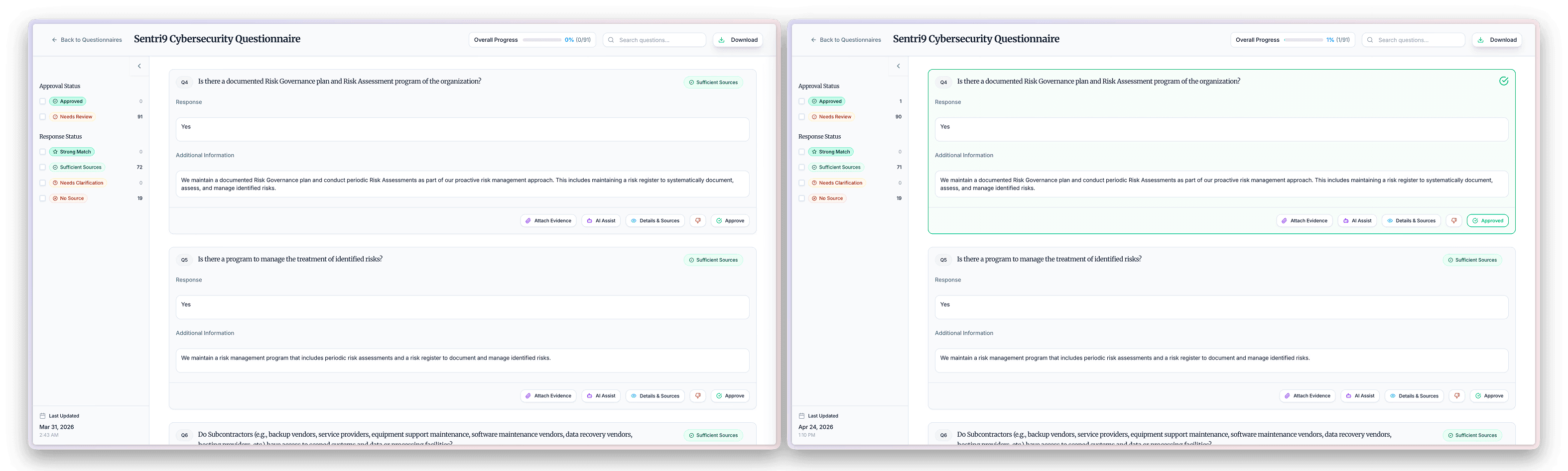
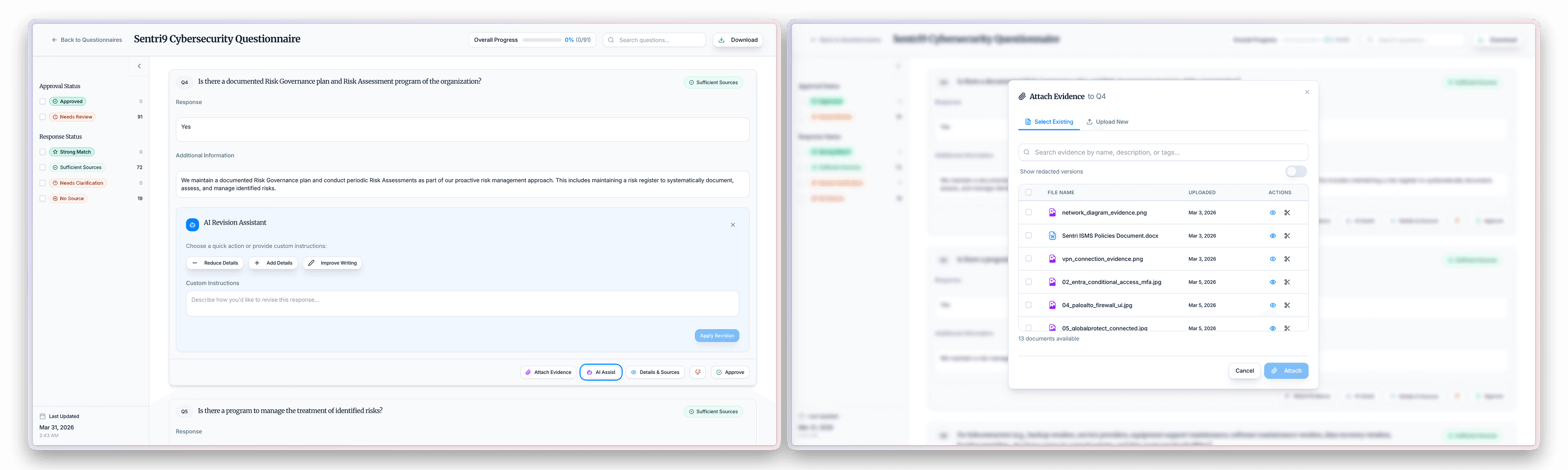
The problems I identified were that the modal-based AI assistant interrupted the review flow, forcing users to contex switch mid-question. The list layout also makes it hard to focus on one answer at a time, and the visual density works heavily against the goal of careful human review.
Version 1
I went through multiple rounds of iterations. In the first one, I focused on the existing design and seeing what improvements I could make. I standardized the design and worked on making sure the modals, popups, and dropdowns were consistent with the rest of the app.
Some of the questions I kept in mind from my design audit that guided my process were:
- How do the clarifying questions appear?
- How do the buttons look/feel — is their functionality clear, are the tools intuitive? They're meant to make the users life easier, so they should be clicked on often
- How does freeform input work when a question needs a written answer?
I also introduced a "Details & Sources" panel that slides in from the right, offering a searchable view of the company's knowledge base to allow for users to search across all the questionnaire answers at once in order to double check their answers.
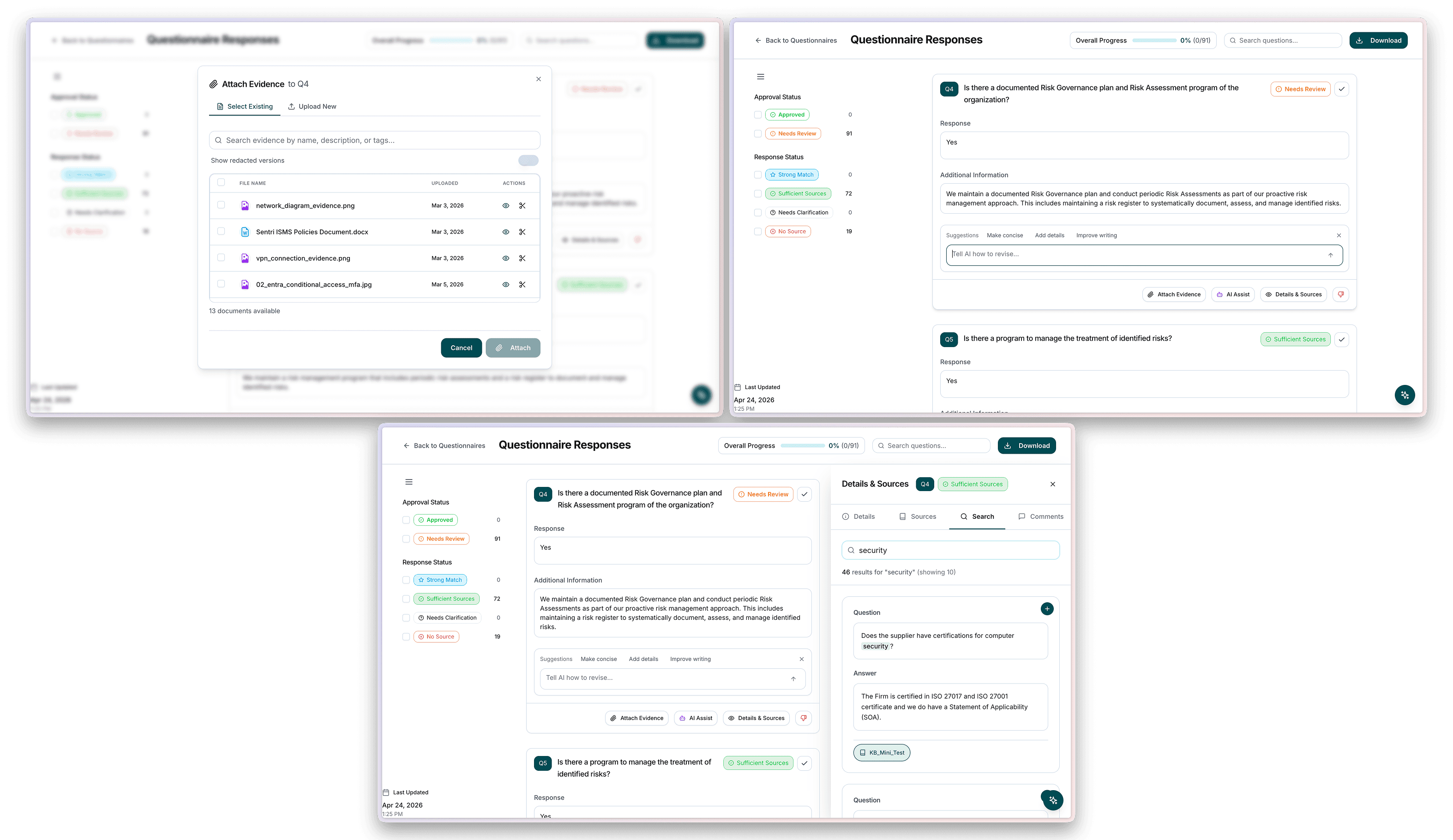
With these new features, one of the main takeaways after doing internal testing was that the core issue, the cognitive load of the questions, was still present. The list view still forced users to scroll past dozens of questions before reaching the ones that needed attention. What was needed was a focus view on a single question, allowing for the full attention of the user to be on reading the analysis, reviewing sources, leaving comments, and carefully approving each individual question instead of being able to scroll through and potentially miss some.
Additionally, the tags for the questions were too ambiguous, leading to inconsistent filtering results. The criteria for a "strong match" vs "sufficient match" was unclear, making me realize that in order to make sure every question that requires manual review gets reviewed, subjective quality tagging was an ineffective way to go about it and increased the room for error.
Version 2
When approaching my third iteration, I aimed to think bigger and make structural changes to the tool instead of focusing on small individual improvements.
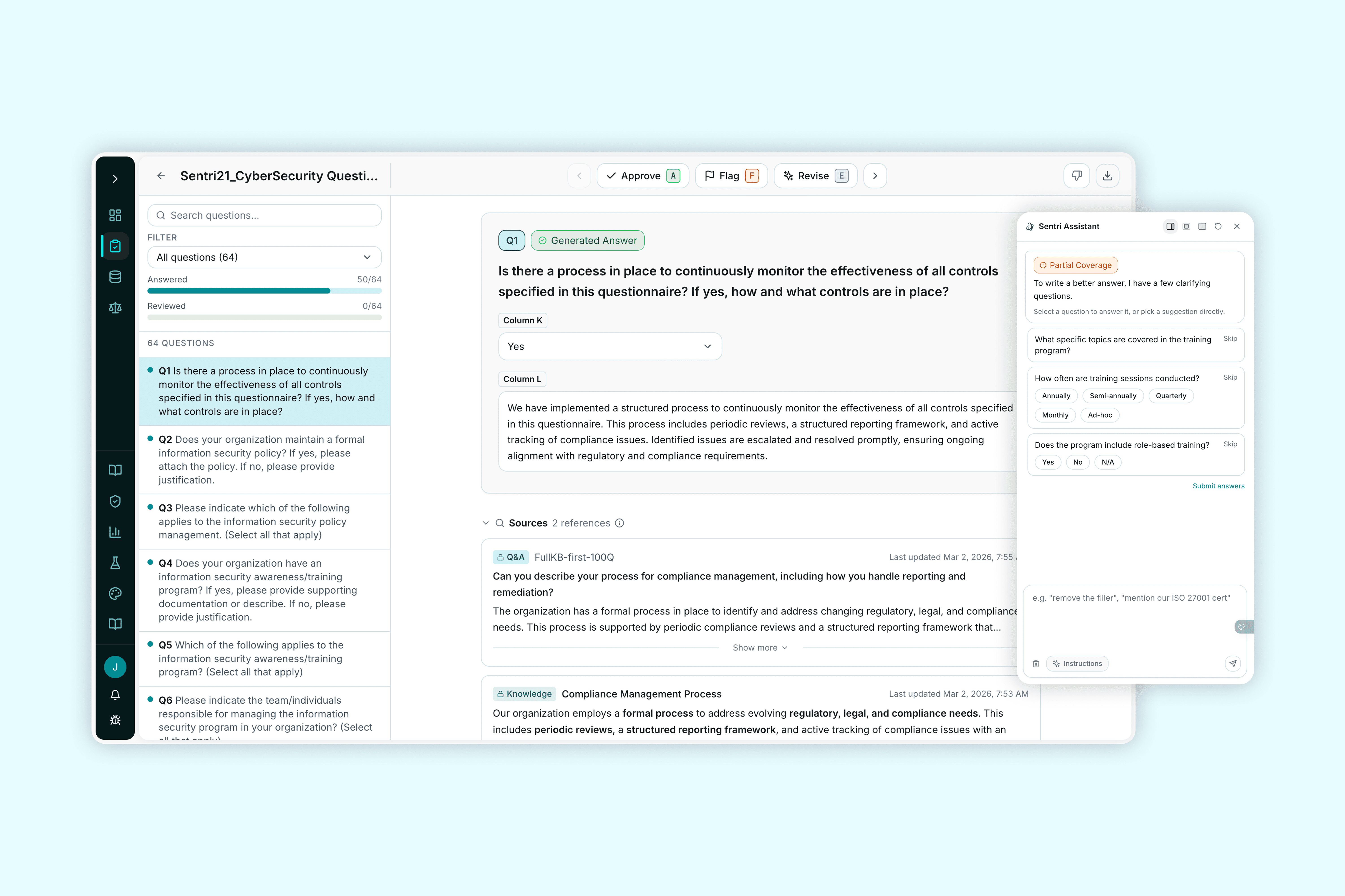
With a focus on prioritizing individual questions, I replaced the scrolling list with a master-detail layout. Introducing a persistent left sidebar that listed all the questions alongside a filter while having a main content area that only displays one question at a time allows for both a bigger picture view and a focus view. The detail view now showed the AI-generated response, a sources and evidence section, and kept the inline revision bar.
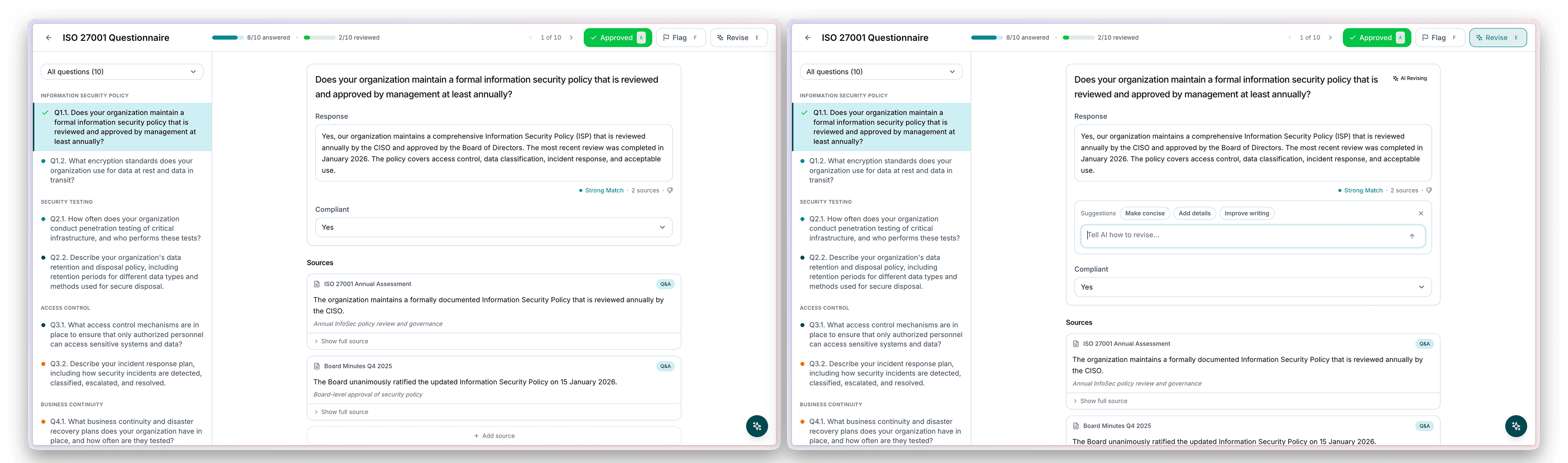
User Testing Session 1
I went through my first round of user testing on this version, hopping on a call with the Chief Information Security Officer of a top Canadian law firm. He had been a previous user of the platform so was familiar with the intended use, and I led an unguided user testing session meant to observe how he naturally interacted with the platform.
Results from the session showed that the question answering platform was intuitive to understand, but some of the main concerns I noted were that although the keyboard shortcuts to approve, revise, and flag questions were built in and allowed for automatic switching to the next question, users didn't tend to notice or use them.
Secondly, feedback that I received highlighted a key security issue, which were the pre-attached evidence files. Every reviewed questionnaire ends up exported and sent out, and depending on the firm or the client, the user doesn't always want the evidence files to be exported. Additionally, the users preferred manual evidence file attaching and would rather add in the right evidence files as needed instead of needing to be extra thorough in deleting unwanted files.
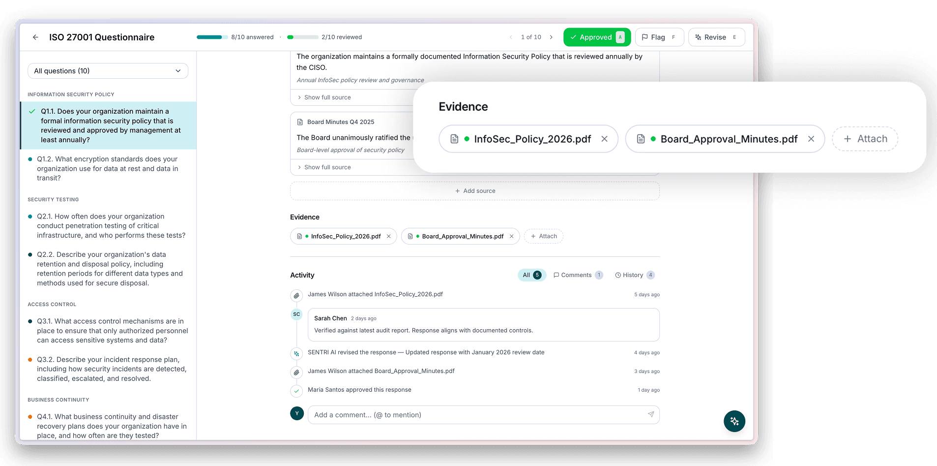
These feedback points and observations really reminded me of the user group I was designing for, which are law and security professionals that have been in the industry for decades and are used to a very archaic and manual process. I realized that just because the slow and manual process had been redesigned in a way meant for speed, it didn't necessarily mean that the users could match that speed right away, and more of the functionalities needed to be presented to the users as the best option rather than just as additional features they may or may not use.
Version 3 + User Testing Session 2
After I made edits following the user testing session, I had the opportunity to hop on another call with a different client, following the same process to see their natural interactions. Some key points that I discovered were that the AI chatbot didn't immediately grab attention, and users weren't intuitively drawn to the chat feature. Even when they opened it up, when faced with an empty and open-ended chat, they tended to still do things manually and find their own sources, formulate their own answers, and verify their evidence by hand.
My main focus on this version was to push the AI tools to the user upfront instead of relying on them to seek them out as resources, so I added in trigger states for the AI assistant to automatically pop out when the user landed on a question that required assistance, such as the questions that require some more information from the user (partial coverage).
Because the open-ended chat interface for the assistant felt too unstructured, and users didn't know what to ask because they're so used to doing things manually. The assistant needed to take the lead — asking specific clarifying questions first, then generating a better answer.
I spent a lot of time formatting the chatbot experience to feel like a conversation and emphasizing the transparency behind the AI's thought process so that it was extremely clear when the chatbot was thinking, making decisions, and producing output. It's crucial for the user to fully understand the decision making process followed and to make sure the thought process could be clear to the user, so adding in features to expand and dive into the sources the AI read, the conclusions it drew, helps add confidence and trust in its answers.
Final Designs
The final design consolidated every iteration prior into one cohesive experience. The right panel AI assistant became a "Sentri Assistant", and instead of living only on the questionnaire page we reworked it to be present throughout the entire app, allowing it to feel more like a companion and resource rather than a one-time occurrence.
In my last few days at Sentri, I was working on an onboarding experience for a separate feature I worked on, and in the future that experience will be brought over to the questionnaire tool as well to provide first time users with a guided tool-tip tour to thoroughly highlight all the new features.
Navigation is made easy with both keyboard letter shortcuts and arrow keys to move between questions, allowing users to quickly approve questions and make their way through the full questionnaire.
Learnings
A Code-First Approach
Working at Sentri was the first time I've been provided with the AI tools needed to ship my own designs, and quickly. I learned a ton about balancing a code-first approach with knowing when to go back to Figma and mock things up manually, and I also learned how to work closer with the engineering team to make sure I'm not stepping on any toes. Knowing when my changes go from frontend changes to requiring backend support, understanding the limitations of designing in code with creating mock data, understanding the data pipelines, and following a different review process than in a traditional design setting were all new things that I learned and adapted to.
Staying Product Oriented When Shipping Quickly
Something I had to check myself on a couple times when working on my various projects was making sure I was staying product and UX focused. When given the ability to ship design changes so quickly, so many parts of the design process get condensed easily, and it becomes a matter of understanding which elements need to stay and which elements need to go. I learned that scoping a project thoroughly is incredibly important because I definitely jumped into making all the small changes that caught my eye first instead of thinking about the bigger picture, and had I done so I definitely would have realized faster that a bigger structural change was necessary for this project.